Things to look out for when creating a pattern library
A pattern library is a reusable, bank of components and resources that can be used across all your interfaces. The result, if done properly, should allow for the rapid creation and maintenance of your user interface; one that can scale consistently across all of your product’s digital touch-points.
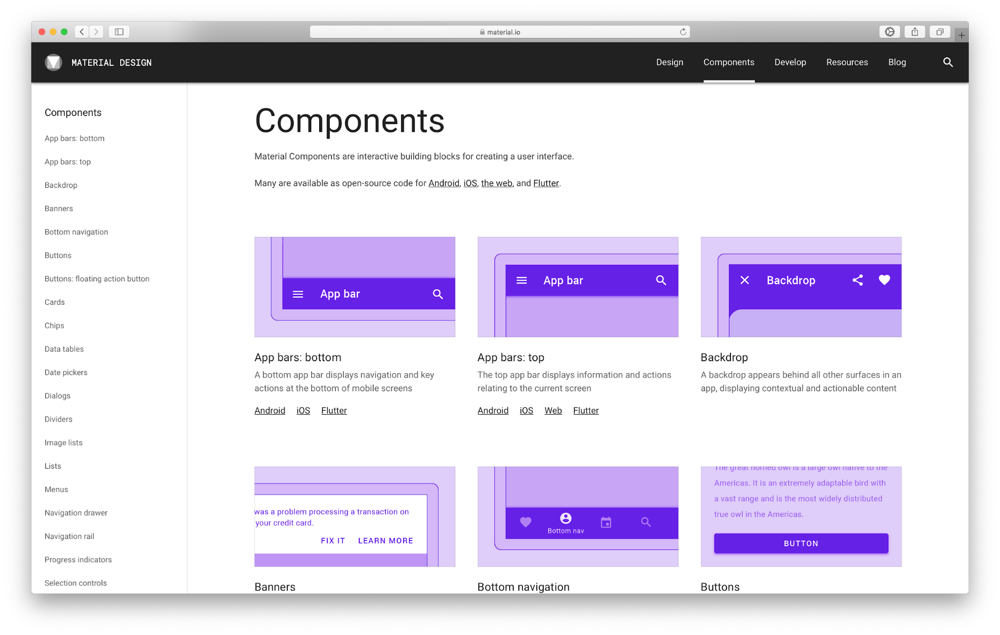
Google Material Design Guidelines
Things to consider when implementing a pattern library
Whilst pattern libraries are a great tool I work with frequently and something I see as increasingly valuable, especially for larger businesses and organisations, they aren’t a silver bullet for all of your visual design problems. In this article, I would like to highlight some of the issues and downfalls I’ve encountered with them as well, which I hope you can avoid too.
A pattern library won’t fix the underlying problems with your product
Consider what problems users face with your product before rolling out a pattern library. Chances are, their biggest issues lie with your service and content. Swapping out patterns on a global scale will unlikely fix these, and if not considered, may even confuse matters further. Consider focusing on your content and how your service operates first. These factors and context in which your patterns find themselves, should inform the requirements of your patterns, and not be complicated by dropping in ill-informed patterns from elsewhere.
A pattern library isn’t a replacement for a UI/UX designer
Pattern libraries are a tool, and like any other tool, they need to be wielded correctly to make an impact. Having a pattern library doesn’t guarantee that dragging and dropping these components into your product will make it usable, or maintain the intended aesthetics of a product.For this, you still need to consider the wider impact when creating/changing any of your interfaces. Often this is in the form of a trained UI/UX designer. Ensuring they are consulted as part of your process when utilising a new pattern/wanting to replace a pattern will reduce the likelihood. They will spot any usability flaws and ensure the layout, and context of these patterns are being used to their full potential and keep your site working in harmony. Consider enabling an individual to be the gatekeeper to your pattern library, somebody who can always be consulted and held accountable when implementing a pattern or making changes to one.
Expectation vs reality
GOV UK’s community guidance on what makes a useful pattern
Just because you have a pattern documented, doesn’t guarantee it’ll work elsewhere too. You always need to consider the context of a pattern and ensure it’s optimal for the scenario it’s being used in. This means testing your systems not based on just patterns, but the scenarios they are in too, as this may change drastically between different areas. Before rolling out a pattern always test it on its own, and in context with its intended audience and react to feedback.It’s also important to remember, that just because a pattern is in the library, doesn’t mean it becomes a hard rule forever. The flexibility to modify a pattern and its rules or even create variations of it are always an option and should be embraced. It’s also very easy to create new patterns as new challenges arise. Which when unchecked can often result in the falling back to the very issue a pattern library intended to solve, too many inconsistent approaches to your solution that are hard to maintain. So when looking at whether or not to create a new pattern, it can help to start by asking the following questions:Things to consider when reusing a pattern:1. Will this pattern solve the problem in this scenario?2. Will a variation/update to this pattern solve the problem?3. Is there an alternative pattern you can create that would better solve the problem?
A pattern library alone, won’t guarantee your product looks and feels great
When creating your website/application It’s important not to become reliant on a system of patterns to project your brand’s look and feel. This is a trap often fallen into and the result can often be sterile and bland. A quote from Abraham Maslow lends itself well.“If all you have is a hammer, everything looks like a nail"Abraham MaslowIt’s also important to recognise that there is a significant difference between a product people can use vs a product people love. The difference between these is often how people feel using your product and this is often what sets companies apart from their companies.This means you need to go beyond just a list of functional components, ensure that you design with emotion and hold your patterns, broader design decisions and your product up to those standards too.As well as documenting your patterns, you should also remember the following aspects of your brand, and ensure they’re used in tandem with your pattern library:
The tone of voice: How your content should speak to users.
Overall aesthetic: How colour, type, imagery and layout should make your experience feel.
Principles: The standards that your product and pattern library should be held against, to deem it fit for your brand and your customers.
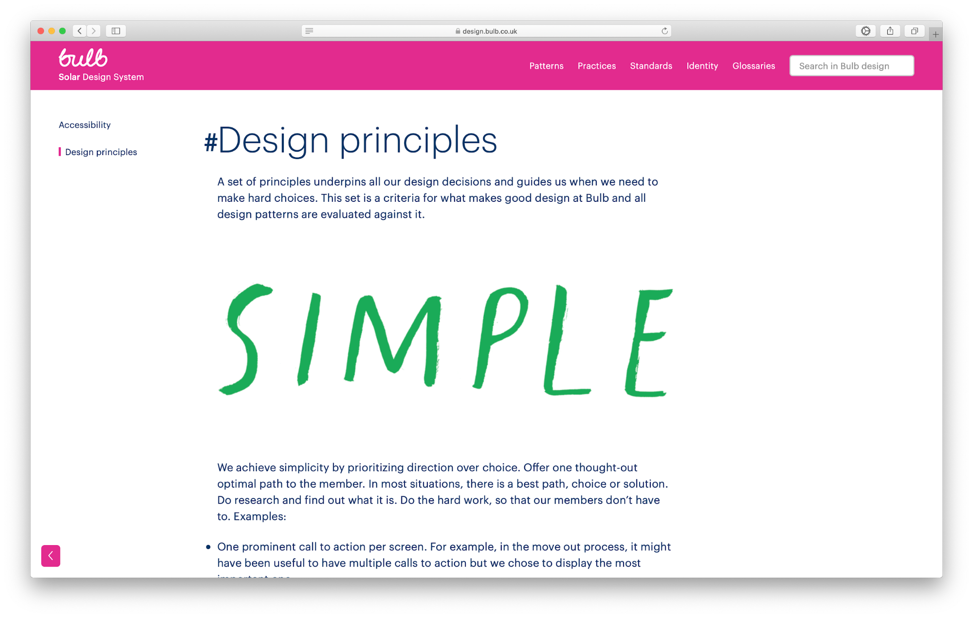
Bulb’s design system ties all these factors in, their design principles sit part of their pattern library, alongside accessibility guidelines and their brand identity,If you're happy your experience meets your pattern libraries rules and principles you’ve set out, you can then test it out with your users. This will be the true test of success and the feedback you get here will really drive how your pattern library grows, listen to your users and ensure you’re constantly aligning your pattern library to their feedback.
Hopefully, there are some pointers here that you’ve found useful. If you’re looking for more assistance with implementing a pattern library at your organisation, please don’t hesitate to get in touch!


