Emotional design: why attractive things work better
Don Norman coined the phrase ‘attractive things work better’, as part of his exploration of aesthetics and the impact they have on our emotional state. We think more creatively when we’re happy and can consider more approaches to a problem. Similarly, when we’re feeling anxious, our thought process narrows; we become less imaginative and focus only on aspects directly related to the problem.
As UX designers, we often think about how emotions impact user experience—whether that means creating empathy maps as part of a user persona, or watching as frustrated users rage-click around on non-cooperative websites in a user recording. And, even if you’re not a UX designer, you’ll experience it first hand all the time as a user. From anxiety induced by threatening ‘low in stock’ alerts and to-the-second sale countdowns, to that small moment of delight whenever the security code appears as an auto-suggestion on your iPhone keyboard mere seconds after it was sent to you.
Navigating the web is a deeply emotional experience, yet we rarely stop to consider just how entangled emotions and user experience are—and how emotion can be used and misused to make us click, like and buy.
To understand just how our brain responds to external stimuli of all kinds, we will be looking at how our affective system (i.e. our emotions) affects our cognitive system (i.e the conscious analysis of sensory information) and how the two interact.
Don Norman separates the emotional brain mechanisms into three levels, which are loosely related to the (debunked) Triune brain theory by Paul D. MacLean.
Don Norman calls these visceral, behavioural, and reflective. The visceral level represents the ingrained, automatic, animalistic qualities of emotion. Appearances (i.e. branding and general aesthetic) appeal to this level, as well as anything to do with fear and sex appeal. According to the Triune Brain theory, this would be the part of the brain which ‘developed earliest’—the primal or reptilian brain (again, this theory isn’t actually accurate, but it’s a useful model for our purposes).
What MacLean calls the ‘paleomammalian brain’, or emotional brain, is what corresponds to Norman’s behavioural level. This level is to do with user experience (i.e. usability and function), distinguishing between good and bad and whether or not we enjoy using a product.
The reflective level, or ‘neomammalian brain’, is responsible for the ‘self’, for conscious thought and making generalisations about the world. We engage this level by intellectualising or otherwise consciously considering a product, whether as a status symbol or feeling like in buying it we are advancing a greater cause.
While no single part of the brain is solely responsible for one level of consciousness, in considering emotion as being related to various levels of abstraction, we can design complete experiences. We are able to satisfy the ‘inner child’ which needs its basic needs met; ensuring our behavioural desires for usability are addressed and that we are, in some way, able to relate our user experience to our perception of ourselves.
Naturally, each of these levels is intertwined with the other and may be operating at the same time. For example, our reflective tendencies might urge us to choose a banking provider our peers use and trust, while at the visceral level, we might eye up one which gives us a better-looking debit card. On the behavioural level, we might consider whose website feels less overwhelming or whose app seems more convenient. Any of these factors could tip the scales towards one provider or the other, and it can vary just how much weight we assign to each.
Emotions are complex, and often the experiences we design aren’t the only factors affecting users. A user might be in a bad mood, feel anxious, or be otherwise preoccupied with the many things that are happening in their life. All of these make up our emotional state, the feelings we carry with us, and the moods we find ourselves in. This, in turn, influences how we might respond to a certain product or website. One day, we might love the happy, bright banking app with its mascot waving at us, while another day, while worrying over unpaid bills, the happy-go-lucky tone might drive us to frustration.
All human decision making is grounded in emotion. Our emotional responses to a product or service influence how we distinguish between options, and how we make up our minds.
Users will likely put up with a poorer user experience if a product or service appeals to them on other levels. For example, a site such as Pool Suite (formerly Poolside FM) is successful not because of its readability or intuitive navigation, but because of its aesthetics, and the feeling of nostalgia we get from it. You could even argue that in trying to improve on any of these factors, the user experience would become worse as it would disrupt the expectations set by the overall aesthetic (it’s worth noting that Poolside FM isn’t a very accessible site—a shame really, as accessibility and delightful, unique design are by no means exclusive, but that’s a different conversation).
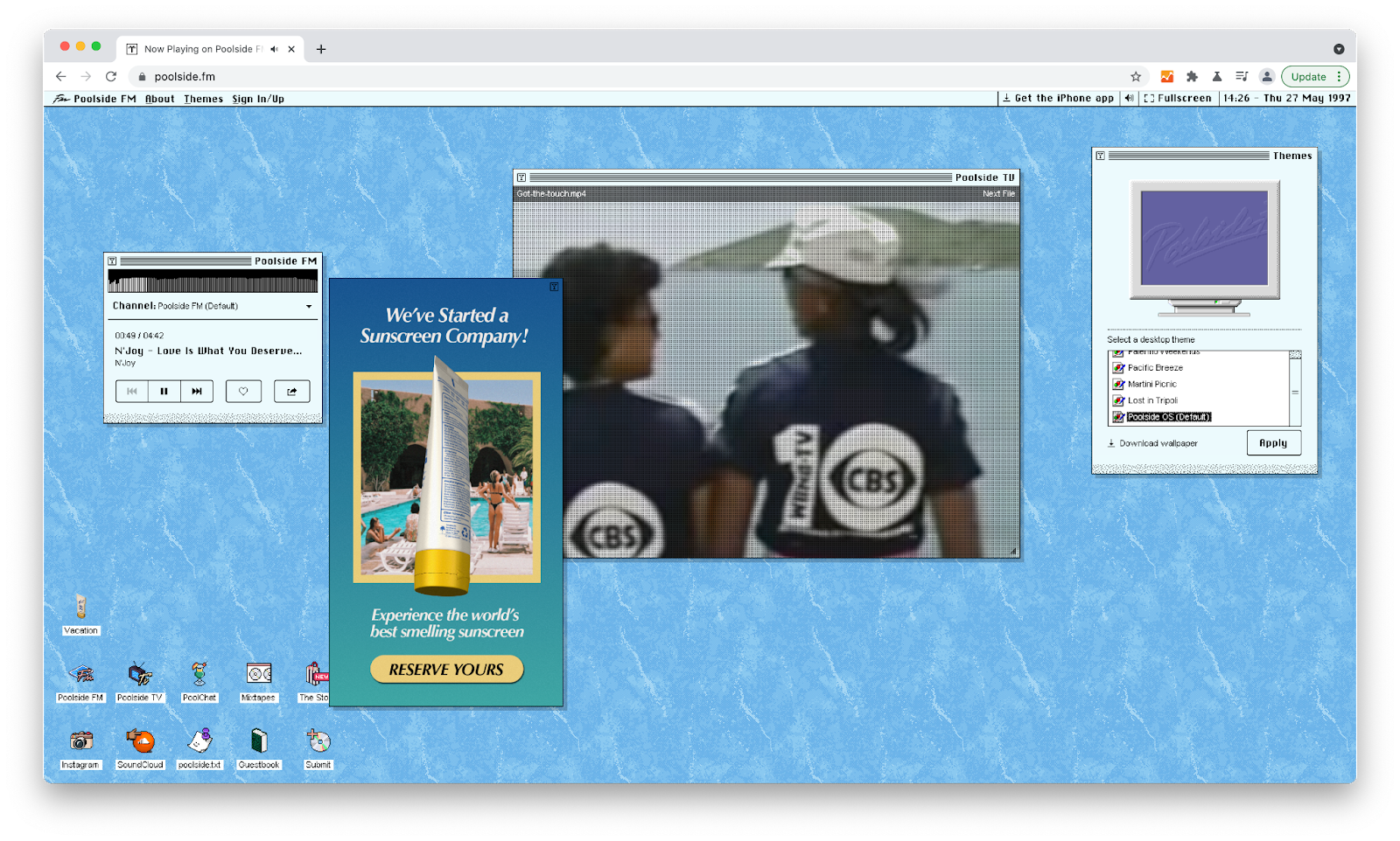
Poolside FM is a retro-inspired online radio station
On the other hand, GOV.UK’s online services must deliver a straightforward, streamlined user experience, to ensure that users can achieve their goals with minimal frustration. Here, a retro UI would likely cause the exact opposite reaction—stress and anger.
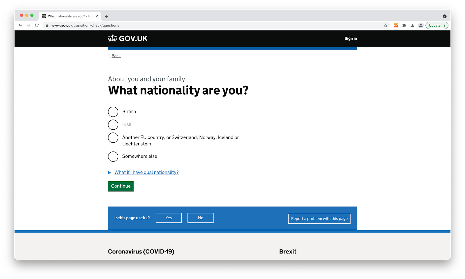
GOV.UK digital services conform to 14 defined service standards, one example being ‘Make sure users succeed first time’.
For some sites, both may be important at different times. A theatre’s website should offer users the ability to browse comfortably while also communicating the values and aesthetics of the organisation. While looking for plays we’d like to see, we might even forgive some oversights in usability if we enjoy the aesthetics of the site otherwise. However, during a busy sale, when time is short and many users are rushing to purchase tickets at the same time, suddenly the reverse is true—our emotional state depends on how quickly we feel we are able to achieve our goal, how dependable the site is and how well we’re able to navigate it under pressure. In this scenario, there is little aesthetics could do to ease our frustrations.
We should also consider the fact that avoiding anxiety in our users isn’t always the end goal. If we are alerting users to a serious security breach, instilling a sense of anxiety would be beneficial to push them to update their password. Similarly, an app teaching you a new language will likely challenge your abilities—using the anxiety that builds up in test situations to help you learn. According to Yerkes and Dodson, the best learning happens when you’re in the ‘flow’, just at the edge of your abilities. Not in the comfort zone, where everything is easy and you’re likely to get bored, not in the danger zone where every step is a misstep—but just before that, where success is possible but is dependent on concentration and effort. In the end, the feeling of accomplishment and pride will make it worth it.
Of course, overusing such patterns, or using them in the wrong context has the potential to be very damaging to the user experience. We call these ‘dark patterns’: using threatening language, misdirection, confirmshaming—designed to force users into completing certain actions. Many of these patterns actively use our emotional responses against us to achieve this.
![A classic example of confirmshaming [Source]](https://images.squarespace-cdn.com/content/v1/5f36833467c5a72f9a98268c/1623072945766-AQJ128KDD5TDU7O7BLH4/tumblr_pk0eq0NoaQ1vp76kuo1_1280.png)
A classic example of confirmshaming [Source]
So, why do pretty things work better? It’s for the same reason we trust one website more than the other, even if both have the same security credentials. Or why we hang on to something ugly and impractical if it is meaningful to us. We might put up with a mouse with poor usability for the sake of aesthetics, or buy a product just because it is on sale. We might choose to trust a banking provider with our money because the app is easier to use and we’d probably use a certain video conferencing software simply because everyone else is also using it. Decision making is an emotional process, whether consciously or unconsciously. The emotional responses to our environment are complex and form the foundation of how our cognitive system makes sense of the world; ultimately determining how we respond to what we experience, the opinions we have, and the decisions we make.
If you would like more advice on user experience, you can view our services on our site, or get in touch.