How does colour affect consumer behaviour?
Since birth, we have been hardwired to assume certain associations with certain colours. The psychology of colour is a subject that has been discussed and considered throughout many different sectors, from marketing to film. The powers of persuasion and emotional influence that derive from colour can not be argued with, yet there is a lot of controversy surrounding the topic of how far a colour can really influence a consumer.
There are many contributory factors as to why it’s considered such a controversial subject, but mostly it’s because there are too many preconceptions around the psychology of colour. Each individual will respond differently to colours based on personal preference, memories, culture and upbringing; so the simple idea that yellow will immediately evoke an overwhelming sense of happiness is more than relatively far fetched. However, colour still plays a large part in marketing. Looking at it in a more practical manner we can begin to better understand colour and it’s true influence.
Take branding, an area that is highly influenced by design and hue; with many people attempting to pinpoint singular emotions to each colour. As previously mentioned, colour is largely affected by personal experiences, meaning there is no one universal translation. However, you can attribute a selection of perceptions and emotions to certain colours. Studies suggest that many snap judgements can be made based on colour alone (dependent on the product), yet, when it comes to the branding, many brand colours are judged on perceived appropriateness; does the colour fit with the proposition? Does it convey the brand appropriately?
Colour directly affects how customers view the personality of the brand; from the excitement of red brands such as Virgin, Coca Cola and Nintendo, to the dependability and trust of blue brands such as Dell, Facebook and Oral B. If you were to switch the colours of these brands, do you think they would convey the same ‘personality’ to consumers? Predicting consumer reaction to colour appropriateness is, therefore, essential to success.

In branding across the Western world, blue evokes a sense of sincerity, honesty, security and sentimentality. Red is exciting, daring, young, unique, independent and cool. You gain a sense of reliability, intelligence, and competence from green, whilst purple offers opulence, charm and sophistication. Finally, yellow suggests ruggedness, outdoorsy behaviour, and masculinity. Taking these traits, it would seem much wiser to consider the colours that will support the personality of the brand rather than trying to align what you would deem a typical colour association.
Consider the context, for example, blue is regularly seen as a cold and sad colour, yet Twitter, Facebook, Flickr and Vimeo all have variations of blue for their branding. These are brands that bring people together and create memories, which couldn't be further from cold and sad, yet the colour fits well, as it evokes a sense of trust and sincerity from the consumer.
When looking at design, it’s interesting to look at colour from two perspectives; from a psychological standpoint, implementing discordant colours will mean that elements will be more prominent, thus, more likely to be remembered for an extended period of time. For example, if your site is primarily green, but you made an element of it red, that element would stand out the most and be most easily recalled, which is why (surprise surprise) so many CTA buttons are often in bold, contrasting colours.
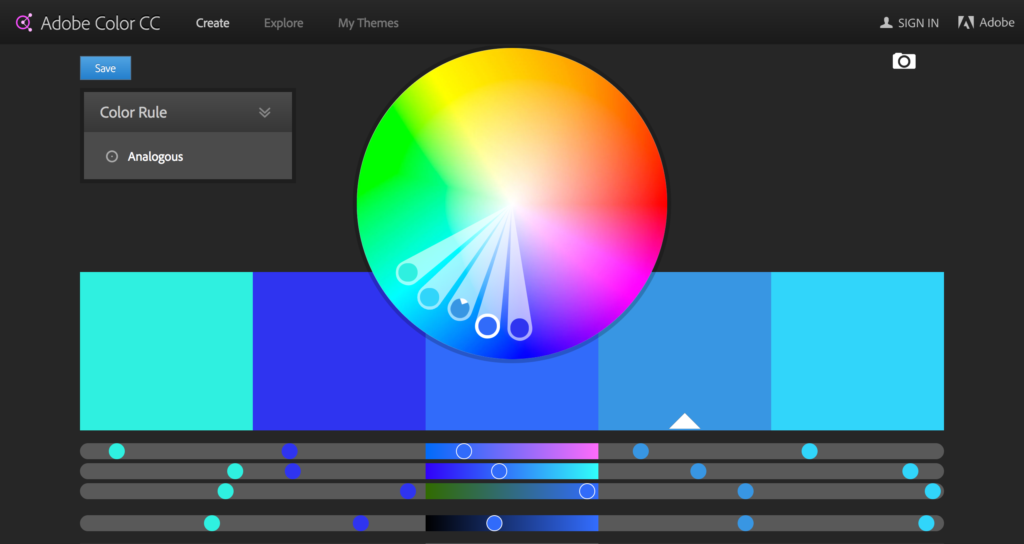
When deciphering colour combinations, there are three schemes to consider, analogous, triadic and complementary; each hold their own strengths when it comes to design. Analogous colour schemes use colours that are directly next to each other on the colour wheel; usually they match well and create serene, calm and seemingly comfortable design. Often found in nature, such as a forest, analogous colour schemes are pleasing to the eye with a sense of familiarity; however they tend to lack contrast, sometimes resulting in a difficulty in drawing attention to key areas.
Triadic colour schemes are much more visually stimulating, with high contrasts between colours. Using three colours equally spaced around the wheel, often using a triangle of equal sides to place them. You get a great sense of vibrancy when using a triadic scheme, offering contrast, whilst retaining a harmony within the colours; a popular choice amongst artists because of it’s strong visual presence, balance and richness.
Complementary colours are opposite to each other on the colour wheel, the high contrast of the colours is used to create a vibrant look, especially when used at full saturation. Often tricky to balance, this colour scheme must be well managed to prevent strain for the consumer. They work well when you are wanting something to stand out (as previously mentioned with discordance within colours), but are a notoriously bad when it comes to use of colour for text.
Being considerate of your colour schemes will help you in understanding the basic psychology of how people will perceive your design, based on colour palettes only. If you want an enigmatic, fun and youthful design then a triadic scheme is your best choice, yet a calm and honest design would be better projected with the use of an analogous palette.
When it comes to colour in film, it’s used in every way possible; emotionally, psychologically and physically. What is so brilliant about the use of colour in film, is that it’s often overlooked, or many viewers are not aware of its significance. Yet carefully considered colour can bring scenes, as well as stories together harmoniously, offering a powerful undertone of emotion and subtle visual cues and connotations.
Through the medium of film, colour can set the entire tone of a movie, it can represent characters, show changes in the storyline, draw focus to significant details and can elicit innate psychological reactions from the viewers. But, how can colour tell a story? Since the early 1900’s, colour has been used in films to richen the story, as well as the image; hand-painted films were the beginning of the use of colour in film, giving a new sensory delight to viewers at the time.
Colour can be used as a form of metaphoric storytelling, offering an underlying sense of anger, greed or sadness throughout, by simply adding a hue to the film.
Film differs to branding when it comes to the use of colour, whilst colours associated with brands can be perceived in different ways dependant on the person; when colour is added to a scene in a film, it instigates natural emotion within the viewer with a much less varied scope of how it can be perceived. Take red, for example, the colour that receives the strongest reaction within film; blood, anger, hate, violence, love and passion are all associated with red and when on screen it’s hard to associate it with anything but the aforementioned. However, pink offers a more innocent, sweet and feminine touch to a movie; offering a sense of calm and an element of light-heartedness to a scene.
Certain colours will always be used to evoke particular emotions within film, and filmmakers continue to use this method to this day. Disney’s ‘Inside out’ is a perfect example of the use of colour directly linked to emotion, with the five characters Joy, Sadness, Fear, Disgust and Anger, correlating with their natural emotionally reactive colour.
Again, you can bring it back to the aforementioned colour schemes used within film with the top four being monochromatic, analogous, complementary and triadic.
Wes Anderson, has mastered the use of colour instigating emotion throughout all of his movies, with his palettes alone gaining notoriety within the art and film world. His palettes are integral to the cinematic worlds he builds, creating a visual language within themselves, the schemes he uses vary; take Moonrise Kingdom, for example, which has an analogous colour scheme, giving a calming and nostalgic feel to the film. Another way in which he uses colour is to soften the emotional harshness of characters or storylines; The Grand Budapest Hotel, which has a relatively dark storyline is surprisingly light-hearted to watch because of the constant use of bright colours which perfectly balances with his injection of humour throughout. It’s telling our brains not to invest too much emotion into the story.
Another example is Spike Jonze’s ‘Her’. There is a visual vocabulary, if you will, a personality to the colours within. Each colour holds an identity that shows the progression and presence of different emotions throughout the film. There is a very strong presence of both reds and pinks throughout, projecting the intensity of love, passion, and possibly acceptance. Secondly you have the colour blue, immediately suggesting sadness and discomfort, highlighted in the painful flashbacks that the character incurs. Whilst yellow is used a lot less in the film, it’s used specifically to reflect uncertainty and confusion, whether it be in clothing or surrounding items. Finally, the use of white offers a sense of neutrality and acceptance around the characters. The continued use of colour makes this film visually rich, whilst enticing the viewers to emotionally invest throughout.
So, whilst colour is more emotionally definitive in film, there is a much larger scope with how consumers perceive it within branding and marketing. There is no direct theory to follow as to how you can influence consumers specifically with the use of colour, but, there is strong evidence to suggest that it will heavily influence your audience and therefore is something to consider in greater depth for future projects.