The lessons learned from our work within the arts and culture industry
At After Digital, we firmly believe that we’re only as good as our last piece of work. To quote our own site, we know ‘that there is no standing still when it comes to technology.’ We see each brief and each piece of work as a new opportunity to learn and a way to keep advancing.
That being said, clients hailing from different industries throw up new sets of industry-specific challenges from which we can learn. In this blog, we explore some of the key learnings that have come from our recent work in the arts and culture industry, including:
The importance of enhanced user experience; from efficient purchase journeys to having timely, personalised information on site without being overbearing.
The importance of having an efficient website for both clients and users
HOMA: A lesson in timeliness

When working on the Honolulu Museum of Art we found their website needed to be focused around their different users’ wants and needs; whether that be a local or a tourist. With these two sets of visitors being so distinctly different in how they used the site, we had to ensure that the online experience they got on the HoMA site would match that of the museum’s world-class physical one—regardless of their intent.
A key finding in doing this was the importance of personalised, timely information. The majority of HoMA members were made up of local residents, focusing their attention on member events, visiting the theatre, and visiting the cafe with friends; essentially they used the museum as a hub for socialising. With that in mind, we created a better mobile experience where members could find member events, passes, and tickets as well as allowing them to manage their membership renewals with ease.
When it came to visiting tourists, the website also needed to support users who expected key information during a visit. People travelling to visit the museum often relied on their mobile device to search for the answers as and when questions arose, such as where to park, what events were on, and maps of the locations; rather than research prior to their visit. To combat this, we created a dedicated ‘plan your visit’ page to house all the required information and created a menu that could be accessed quickly and easily across the site; allowing visitors to get to this crucial information fast when needed.
In addition to this, we also worked to cut the risk of confusion for non-English speaking visitors who would often arrive at the wrong location, and attempt to visit museum tours on their own—triggering complaints from tourists and locals alike. By introducing functionality that was able to identify users based on their browser language, we were able to provide bespoke pages and translations that made their trip planning and resulting visit easier.
This is just a snapshot of the work we did with HoMA, however, it highlights the importance of “now moments” and the format in which users expect key information that might inform their visit. In short, it emphasises the importance of providing timely information as and when your user needs it.
The Southbank Centre: A lesson in efficiency

The Southbank Centre wanted to improve the user experience on their site; whether it was buying tickets for an event, making a donation, or buying a membership/voucher. With a vast range of offerings and a high volume of orders, a feature-rich account area was also key to helping customers on the Southbank Centre site to self-serve.
Before tackling this project, our team conducted research into existing purchase habits and site usage. Results ultimately showed users often struggled with common tasks critical to success and that this was often exacerbated by increased demand. With this in mind, we distilled our findings into 3 core areas:
The site had to be fast and able to cope with periods of high demand.
The purchase path had to be re-envisioned with the user at the forefront.
The account area had to be more effective when it came to allowing users to self-serve.
In short, the site had to be efficient and able to maintain that efficiency during periods of high demand and high traffic.
By implementing social login via Google, we were able to reduce the number of drop-offs at the login/registration step and, by overhauling the seat selection interface, we were able to create a step in the purchase process that was more engaging and easy to understand. Both of these steps were key to creating a purchase path that put the user first.
When it came to tackling the account area, we introduced a range of features, including an overview area for members where they could see their benefits, access their member barcode to scan in, see upcoming events, and view previous orders. And, we also worked to create an access requirements section that allowed members to specify their exact needs should they require assistance.
Efficiently knitting all of this together was our Skyway product. Skyway utilises a micro-application architecture which means we are able to use the best technology for each part of the application; rather than relying on one monolithic application. Its scalability and functionality meant that we could create a bespoke experience for their Tessitura-based purchase path that also integrated with The Southbank Centre’s existing Drupal site—a solution that also wouldn’t be negatively impacted by those periods of high demand. The flexibility of Skyway also meant that we were able to offer bespoke purchase pathways for different types of events within the Southbank Centre site, for example, their gallery tickets clearly require a very different user interface to their seated performances.
Auditorium Theatre: A lesson in ease
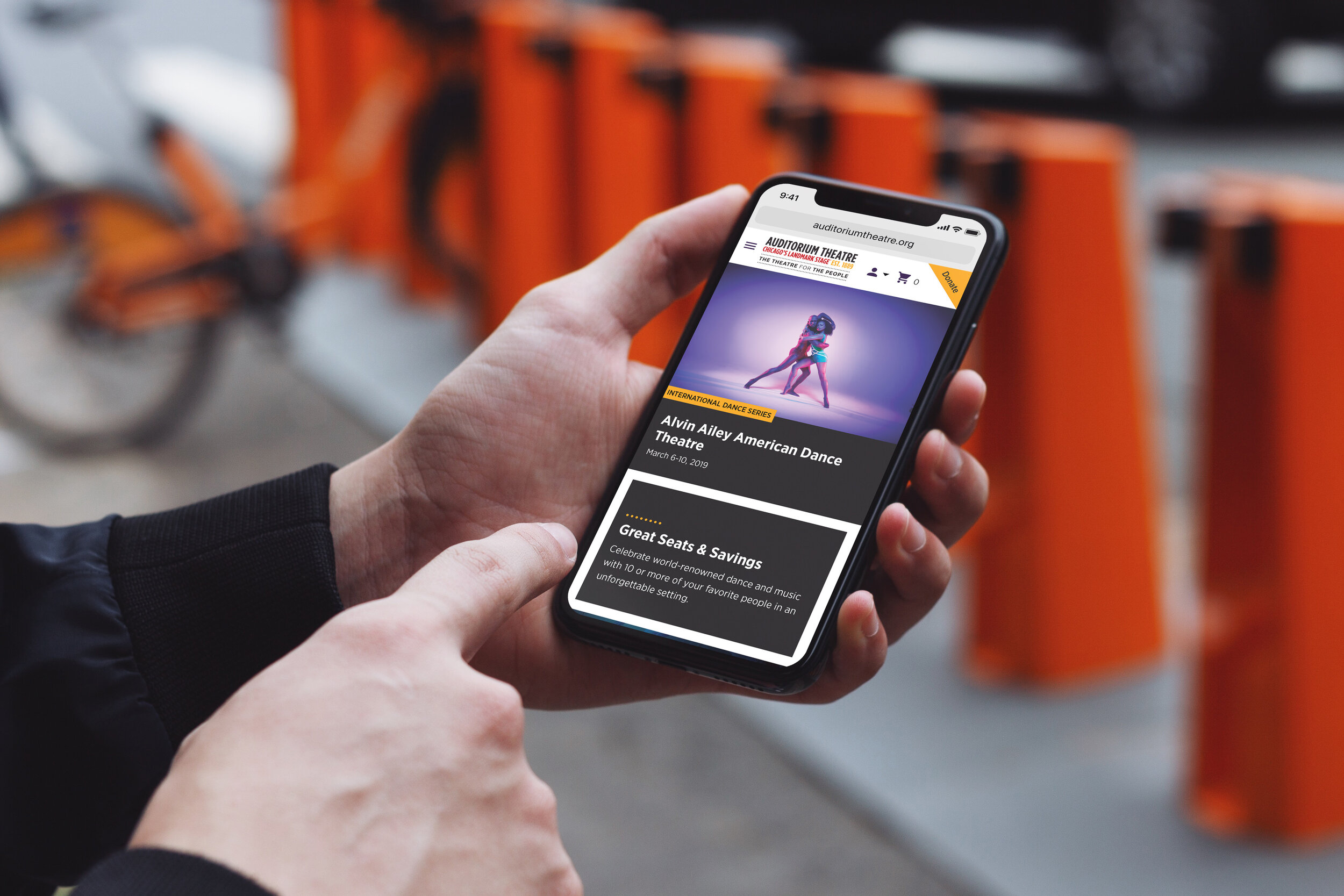
The Auditorium Theatre in Chicago came to us looking for a new website with online purchasing facilities. In our initial research into the purchase path for this client, it quickly became clear that users struggled to select seats on mobile devices, with the pan and zoom features being difficult to use. This resulted in users frequently abandoning the purchase journey before reaching the checkout.
To tackle this, we incorporated app-style interfaces that made the site more user friendly and encouraged users to follow through with the purchase. Our intuitive, full-screen, seat selection interface allows users to use gestures, like pinch and zoom, to get to the seats they want and resulted in a 49.81% increase in session duration on mobile from launch.
To further tackle the clients' needs we, again, used our Skyway product to create an award-winning purchase path that allowed for a seamless booking journey for their customers. This minimised friction for customers but also allows the Auditorium to provide multiple offerings on their site. And, by using WordPress to build the site, we enabled administrators to have full control over the structure of each page in-house, while maintaining a high degree of visual cohesion.
Overall, our work with The Auditorium Theatre showed us the importance of providing solutions which make journeys easier; from customers making a purchase to in-house teams being able to update content without the assistance of an agency.
Overall, much like the arts and culture industry, we keep creativity at the forefront of our minds, especially when it comes to tackling the ever changing needs of our clients. It’s also important to look back on previous challenges and discover the key factors that resulted in a solution. Whether it’s web development, or UX design; we are always taking our learnings and turning them into actionable insights for the future.